7 Web Design Trends for 2019
The expectation that virtual and augmented reality web design was to take over this year hasn’t realized yet. Instead we see more experimentation with color, shapes, fonts and storytelling style. Along with that, minimalism is refusing to fade away.
Web design is not an exact science. What worked 10 years ago may not work today. It’s hard to predict where it will go, but for us at Speedflow Bulgaria, it is fun to trail the latest developments and trends and keep on top of things.
The other thing is that web design can have two contradictory concepts trending at the same time. And while this can be confusing, we shouldn’t forget that both can be used to the same degree of success to achieve different things.
In line with our article 7 web design trends that rock 2017, we thought it was time for an update. Here are the 7 most widespread web design trends for the first quarter of 2019 (a note must be made here that this is not an exhaustive list of the web design trends of 2019. We have selected the best 7, according to us). Enjoy:
1. Organic shapes
Example: Mawla
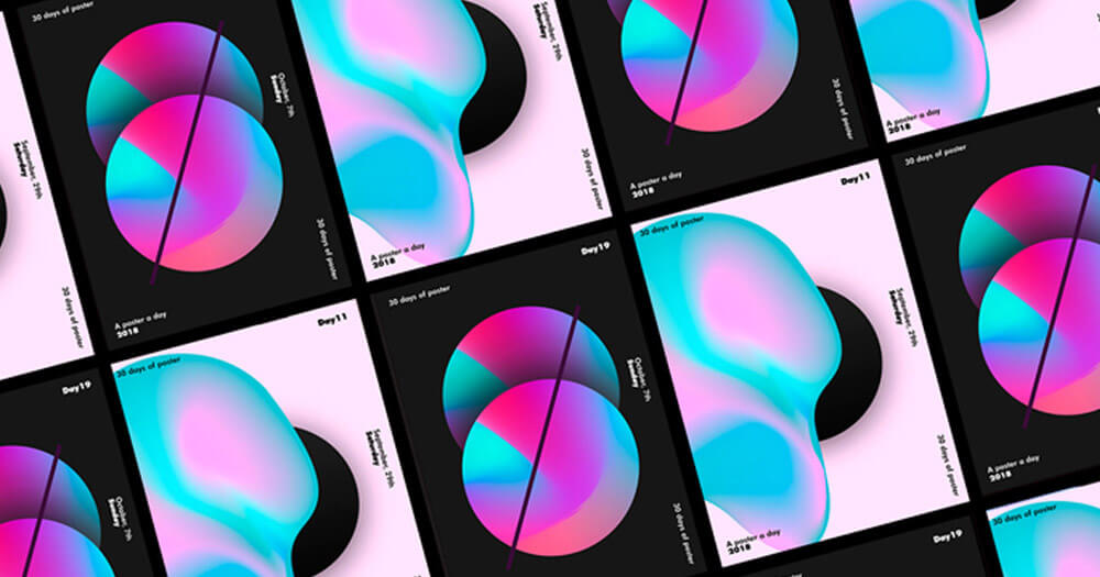
The folks at Mawla, for example, use a blend of organic shapes and bright colours to create a pretty appealing website.
Paper cups, biodegradable bags, reusable sandwich bags, shower timers and wooden coffee-stirring sticks: you get the point. Society is headed towards a more nature-integrated existence. And web designers are following suit. In fact, web design seems to be becoming more socially conscious by the day.
For 2019, we see a huge rise in the use of organic shape elements. Rounded, leaf-, tree- and wave-like shapes are everywhere, inspiring a more natural look and feel.
2. 2 x Video
Example: Oand3
Oand3 have boldly placed a loop of nature scenery Above the Fold on their homepage—to pleasing results, we must say.
Video is multiplying. It’s not hard to see why. Through video, users can ingest information without expending too much energy, and perhaps this partly explains why video is so popular. As of 2019, web designers are experimenting with video placement to varying degrees of success. More and more websites are using full-screen video in the Above the Fold section – where they can leave an impression and show first-hand what their product is all about.
Along with the video marketing becoming more and more popular, big brands are now using auto-play videos as a background to their home page.
3. Micro-Interactions
Example: Micro-interaction on Dribble
Micro-interactions are wide spread to the degree that you can stumble on one in most modern websites you visit. Here is an example of what they look like.
Have you watched Lie to Me? For those of you who haven’t: it’s about a character who is brilliant at reading facial micro-expressions and body language. Whether we are aware enough to detect such minute interactions or not, it doesn’t matter. They affect us nonetheless.
In 2019, web designers have embraced methods of micro-interaction, including subtle animations, creative picture content and others.
Here are a few digital elements used to create micro-interactions:
- Scrollbar
- Button
- User-triggered animation
- Swipe animation
4. The Color Rebel: Black and white is making a return
Example: Councl
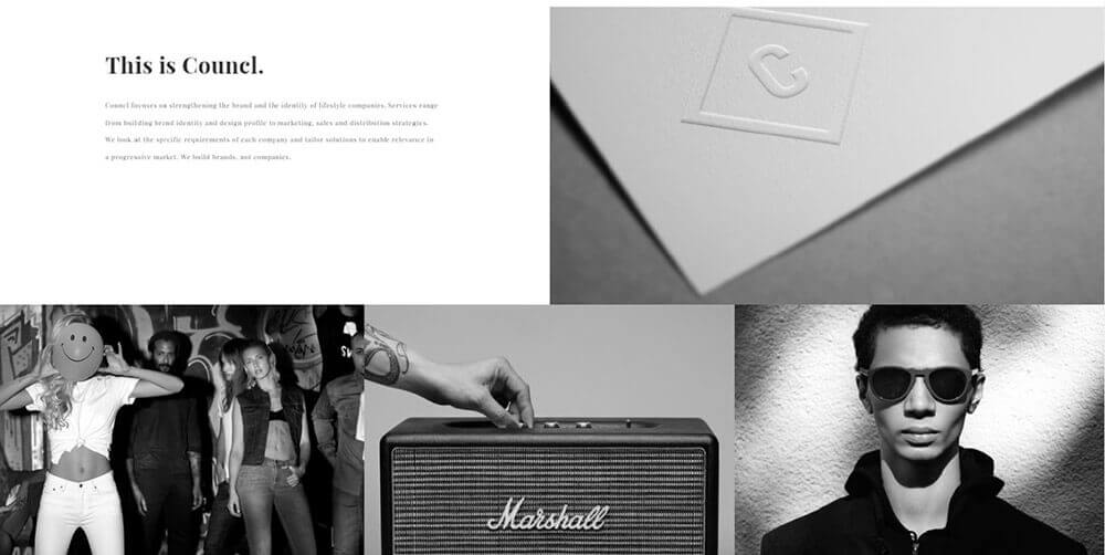
Here, Councl demonstrate an effective use of black and white elements. The result is an uncluttered, elegant website.
Web designers have been riding the wave of minimalism for a couple of years now. Along this line, black and white pictures are making a return. And they fit quite well. This could be because black and white compositions impress on us a sense of timelessness and depth that is not immediately visible to the eyes.
This stands in contrast to another design trend: the increasing use of bright colors. Moving onto…
5. Bright colors and gradients
Example: Atlassian
In contrast to the previous point, Atlassian demonstrate the effective use of bright colours to achieve an interesting website without compromise to simplicity.
Color is web designers’ AK47. And in the past year and in the beginning of 2019, some of them are shooting it like crazy. Bright colors and strong gradient have become widespread. For example, placing a brightly colored element in a less impressive background can make it stand out and improve CTR – basic psychology of colors.
6. Broken Grid – Asymmetry
Example: ClinicaBenessere
Scroll down to see what the broken-grid method means. It is an interesting approach which keeps the ‘surprise’ element alive.
The first three months of 2019 are a natural continuation to a design trend that has taken hold of web design since 2017 – the broken grid method.
Asymmetrical placements of elements designed to anticipate the gaze of the internet reader rather than draw it in are becoming popular. Time will have the last word on this approach.
7. Serif Takeover
Example: The Guardian
Perhaps, The Guardian can afford to experiment with fonts. They are big and have a loyal following. But they are not the only ones we see using serif.
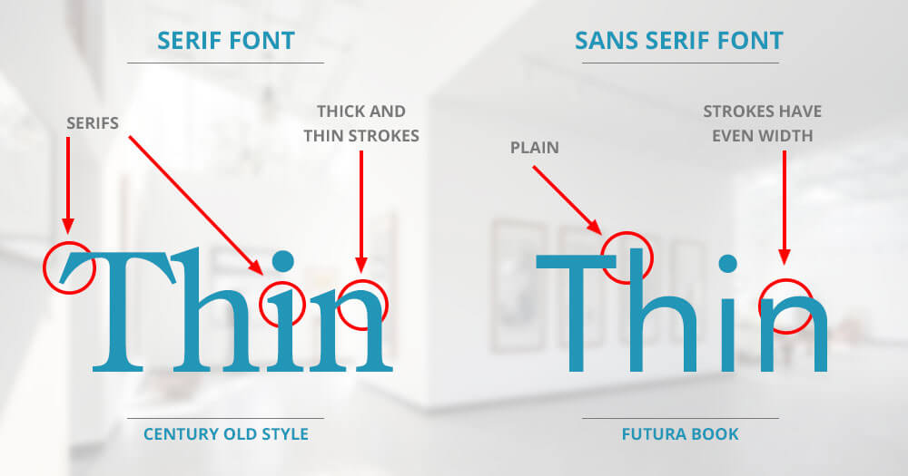
The general consensus is that serif is only suitable for print. You see, sans serif is easier to read, which can be important in today’s age of mobile devices. But the first quarter of 2019 has seen a return of the serif font. Because of its link to the past, serif exudes a certain dignified air and, for this reason, it is a good fit for some brands, while for others – not so much.
These are just 7 of many, many web design trends that are happening right now. We expect to see VR web design hitting soon but its price might be putting off website owners at this point in time. Another interesting concept we’d like to see more of is creative, engaging scroll storytelling.
If you need professional web design and web development services that create unique user experience, talk to us at info@speedflow.bg to get a quote.
Or, if you have a different vision about the future of web design, please let us know in the comment section. We’d be intrigued to hear it.
Recommended Posts

Does your website make a good first impression?
February 20, 2018
Image SEO optimization for search engines
December 20, 2017


