
Does your website make a good first impression?
We can optimize and improve our website in a number of ways. We can use A/B testing, install different plugins, tools and add-ons, Google Analytics, JS galleries, quick buttons to social networks, and a million other things … Our desire to be up-to-date and have everything on our website may turn into an actual limitation. We forget the most important thing – the first impression it has on visitors. Oh, the first impression is crucial. Even small details may send them off to the competition. So, how can your page make a great first impression?
The eyes look, the mouse acts!
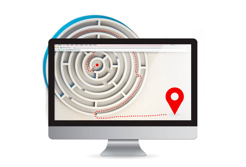
 People can not do anything with your website except look through it and click with the mouse (we are not including those movie hackers who do not use any computer mouses). That’s the way they will experience your brand online. The eye simply scans the page and locates information within seconds. Does your website follow eye logic? Does it make it easy for users to find what they are looking for at first glance?
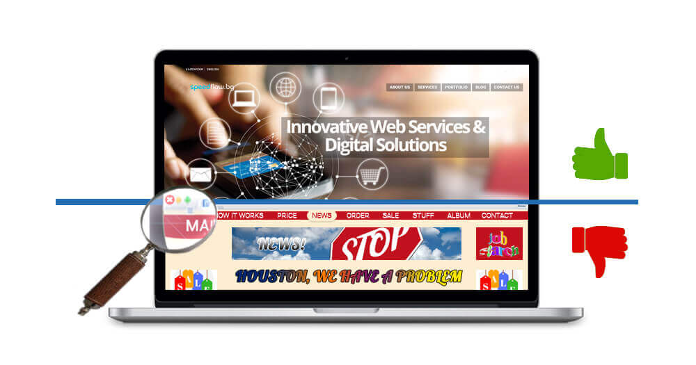
Overcrowded home pages, packed with a lot of information, do just the opposite. A user assesses a website in only a second. If you want to make sure that your website is attractive enough, we advise you to read our articles: “Good content – an essential element for website success” and “The psychology of colors in Web design”.
What do you have to offer?
This moment is critical. Even if your website guides the user smoothly and easily through the pages and all the information is arranged intuitively, if you do not state what you are offering loud and clear, you risk losing the client instantly. Don’t forget that your offer should be the right one for your visitor. It should satisfy his necessity for the specific product or services and solve his problem.
And now what?
 All right. Let’s say you’ve covered the first two main requirements – users can easily navigate through the website and know exactly what you have to offer. Now you need to show them how to get it. Maybe it’s just information; maybe they have to buy something. Make it simple for them. Wandering around your menu and trying to figure it out by themselves is a big No. Don’t annoy your customers before they have even become real ones. Let them get what they what as quickly as possible. At the end of the day, you want the same. Time is equally valuable to both sides.
No room for mistakes
You may be thinking things like: “If someone has found us online, then he/she must be really intrigued by what we have to offer. So, they will take their time to find what they need. They will also grasp our complex industry terminology and read all the information we’ve provided.” Wrong! It is a possible scenario, but not at first sight. Needless to say, a single look leaves a powerful first impression and determines users’ subsequent actions. There is no room for mistakes or excuses. They work against you.
If you’re not sure how to do all of this, contact Speedflow team at info@speedflow.bg. We know how.
Recommended Posts

6 Web Development Trends Expected to Rule 2020
January 22, 2020


Snowy Christmas with Speedflow Bulgaria!
November 15, 2019