
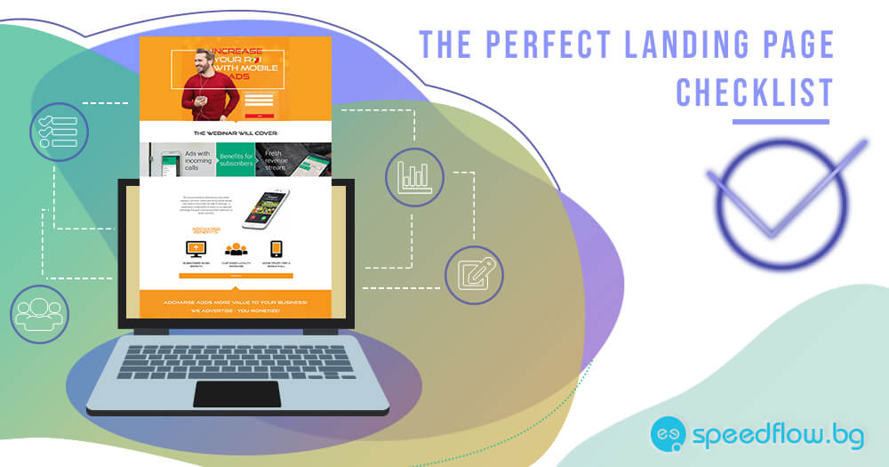
The Successful Landing Page Guide
The main purpose of a “landing page”, also known as “click-through page” (the page that a visitor lands on after clicking an ad with a link to a website) is to boost your digital marketing campaign and make it even more effective. It can help you turn potential clients into real ones increasing the number of successful conversions. This is the page on which a user will end up after clicking on your ad/banner/message somewhere online urged by the desire to learn more about your offer, product, service, etc.
Every landing page is unique in itself!
Therefore it will be very difficult to find a universal guide that can be applied when creating any type of landing page. In today’s article, we present to you the main and most important elements which can guide your way when creating the perfect and successful landing page for your next advertising campaign. But before choosing which ones will best fit your initial purpose, you need to answer the following questions:
- What do I need the user to do?
- Why does the user have to do it?
So, here are the fundamental elements which we recommend that you try to incorporate in your next landing page to make it more effective and successful. Choose the ones that will best fit your goal:
A headline, which should be short, precise and straight to the point about what you are offering. It will be even better if it matches the anchor text (the text that links to the “click-through page”). Do pay special attention to your word choice. Words should trigger a genuine interest in what you are offering. If you are not quite sure how to do it, read our blog article “How to write a good title”.
A subheadline that complements the main headline and gives more details about what the user will get in return for completing a particular action. Be persuasive!
Any additional explanations or descriptions should be included in case the main headline and subheadline do not provide all the essential information a user might need. For example the date and time of your webinar.
Advantages and benefits of your offer as well as what differentiates you from your competitors.
What will the user gain after doing what you want them to do?
What will the user lose, if he/she does not complete a particular action?
Logical flow of all texts in the “after-ad-click page”. Your persuasive thoughts should be expressed in a logical succession. Every bit of information should be a perfect addition to the previous one.
Images should be both attractive and informative. If your landing page promotes an e-book, a prize in a competition, a webinar or anything else, include a visual of it.
SEO optimization of the landing page images and texts (meta titles and descriptions, alt text, keywords, URL, etc.) so that search engines can index it and rank it better in SERP.
URL address that includes keywords describing perfectly the page content and is as similar to the main headline as possible.
Design that provides a unique user experience. If possible all important information should be presented on a single screen, so that the user does not have to scroll and do any unnecessary actions. However, if that is not possible, try to put the most important information first.
Responsive design that adapts perfectly to any type of device screen. Let’s not forget that mobile search has surpassed traditional desktop search. Your landing page design should follow this tendency.
Eliminate help menus, extra navigation, top, and sidebars (if possible). Research has shown that including these in your landings negatively affect their conversion rate.
Do not use your home page as a landing page. Why? Because in general home pages are filled with lots of information that would rather confuse the user than give him/her any concrete direction of actions. They might not be quite sure what is expected of them. Where to click and what the end result would be. Having a completely new landing page developed for a specific purpose would be way more successful in turning a potential client into a real one.
Positive feedback, client testimonials, user ratings, expert recommendations.
A Contact form, which can be short or long depending on your campaign requirements and the information you want to learn about your prospects. We advise you to personalize all generic buttons. Instead of using a “SUBMIT” button go for “I want this brochure” button. Do not forget to change the settings so that anyone who has already filled the contact form is not able to do it again.
Guarantees and certificates are a powerful tool for boosting the authority of the page, your products and brand as a whole.
CTA (call-to-action) is a definite must. Use phrases like “Download now”, “Buy now”, “Check it”, “Try it”, “Optimize your business”, “Win for free”, etc. It is not a surprise that these are among the most widely used CTA. They influence people’s decisions. Of course, the right CTA for your campaign should be chosen elegantly and with style.
Sharing options can be included to make the click-through page even more popular. This would help with increasing its traffic, views and consequently conversions.
Put a logo to boost brand recognition.
Fig. 1 Landing page example
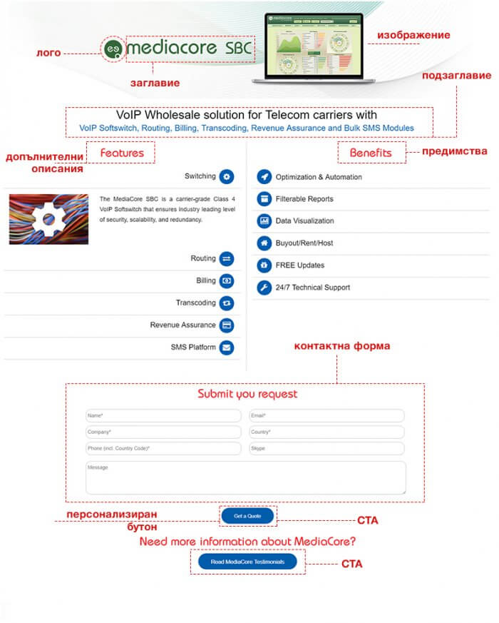 *As we have already mentioned, every landing page is unique and it is not necessary to include all of the elements presented in this article. Elements not used in this example template: 5 and 19.
Is there anything more you would like to add to this successful landing page guide?
Recommended Posts
How to improve your website speed? – Part 1
December 14, 2018
Facebook or Instagram what is better for my business?
December 3, 2018